Hello! For this week’s movies, the focus was on color and its implementation in films. Since there is no color in black and white films, I focused on the use of light and shadow. “Mo’ Better Blues” is a Musical/Romance directed by Spike Lee in 1990, and “Cat People” is a Horror/Fantasy directed by Jacques Tourneur in 1942. Using color in a film is not necessarily considered an advantage, despite it looking more eye-catching. In The Last Detail, it’s stated that “Sometimes, these color decisions are made to communicate something to the audience about the story that isn’t obvious on its surface.”
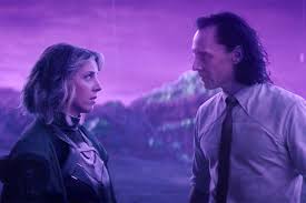
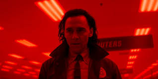
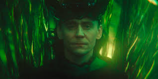
The Last Detail also notes that “Filmmakers do this kind of thing a lot; they use the audience’s awareness of color at a near reflexive, subconscious level to communicate narrative information efficiently.” I feel that a good example of this is the show “Loki”. Something that made watching this show so intriguing was the use of many vibrant colors for the different locations and scenes in which Loki found himself.
Mo Better Blues
Right at the start of the film, while the credits are rolling, all the shots are cast in a different color. Lee does this to catch the audience’s eye and draw them in before the movie has even started.
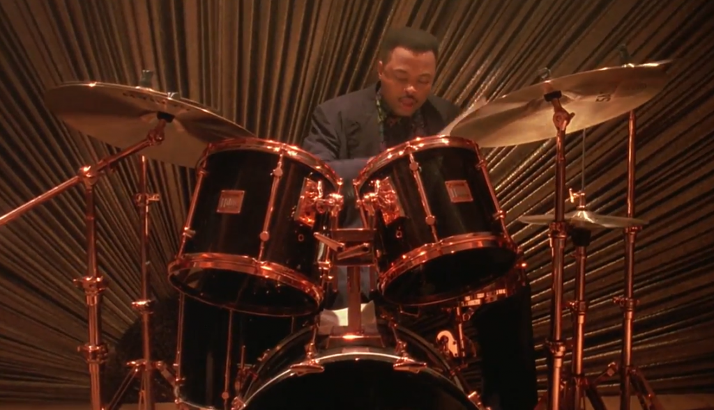
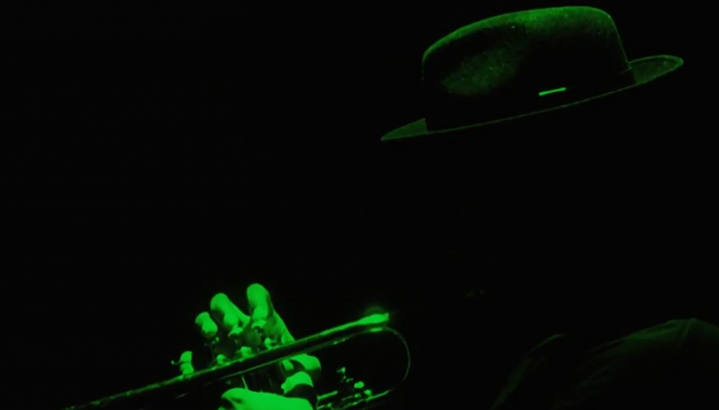
The lighting here is more yellow and gold to accent the gold of the drums. It makes for a very aesthetic frame and elicits a “wow that’s so nice” reaction from the viewers.
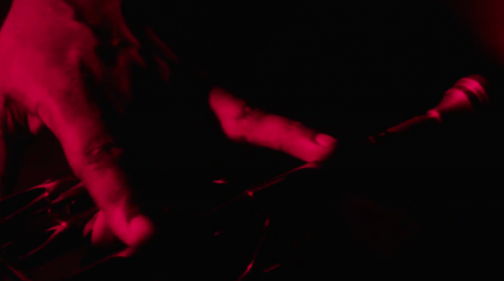
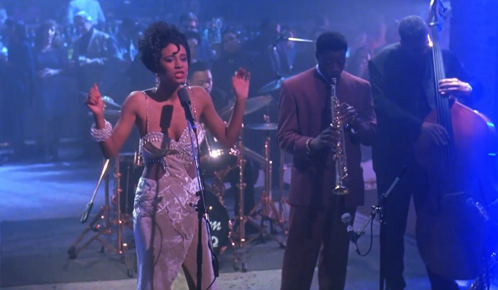
From the start of the film to the end, I noticed that red was a prominent color throughout. Almost every scene—every frame—had the color red in it, whether it’s the lights or what someone is wearing.
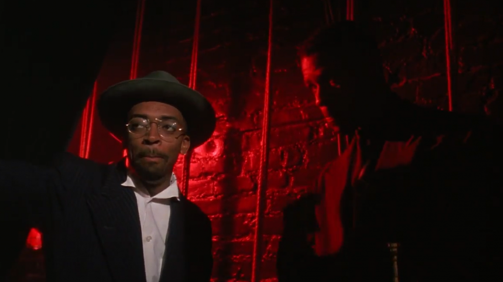
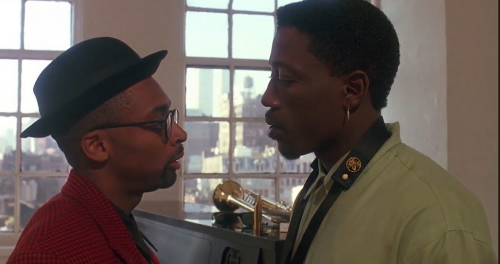
I like how in this scene the characters are wearing the color that relates to their stance. One is wearing green to portray that he’s right, while the other character is wearing red to depict that his stance is wrong. The one in red was late, and he brought a woman to their dressing room. He was trying to explain to his friends why it wasn’t bad, but at the end of the scene, Bleek emphasized “don’t be late and don’t bring women in here”.
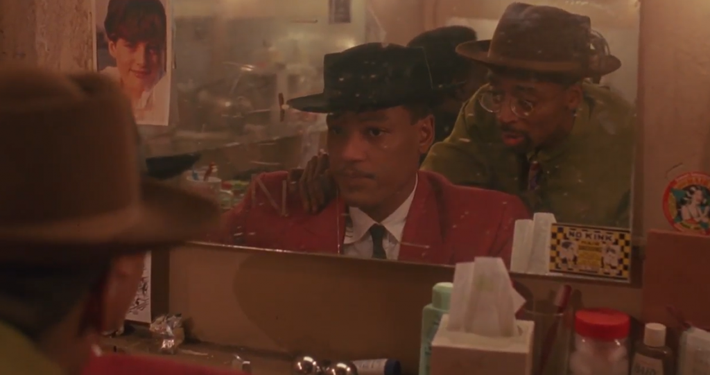
The same thing can be seen in this screenshot. One character is wearing the “good” color and the other is wearing the “bad” color. In the prior picture, Giant was wearing green to show that he was right, but in this one, he’s wearing red. Shadow had said, “You’re supposed to take care of me,” and he was asking about where their raise was because Bleek was “bringing in a lot of cash”. In this shot, you’re able to understand that Shadow is right, and it makes the audience side with him. Oftentimes, directors will dress their actors like this to tell the audience something without the characters saying it.
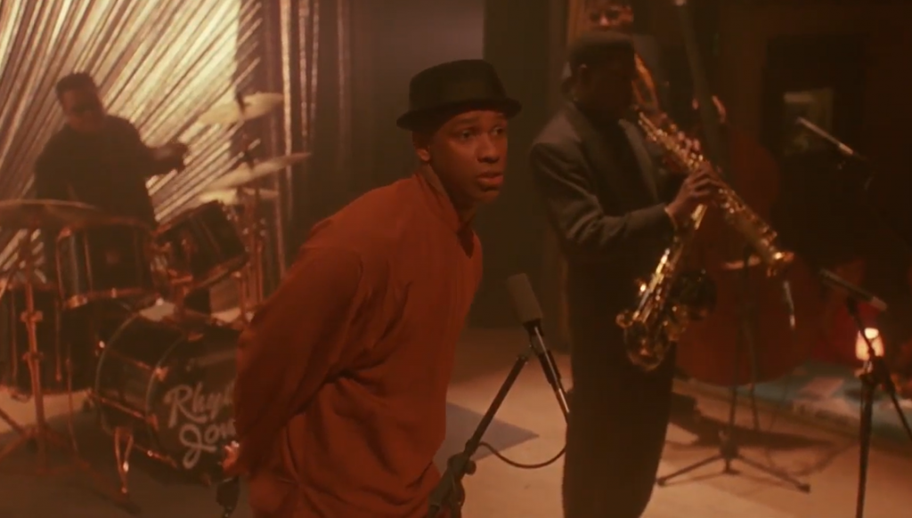
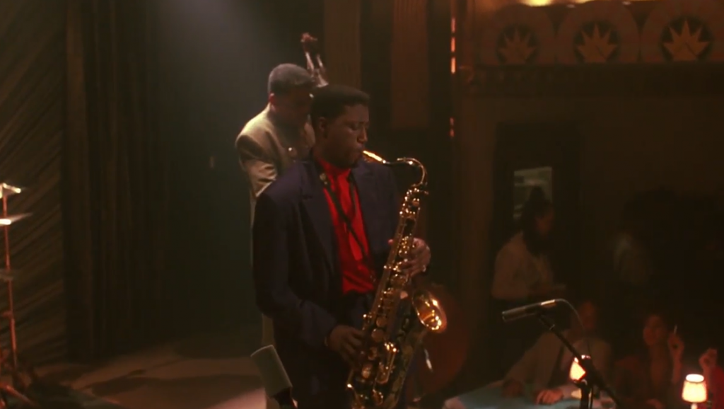
In this scene, Bleek is on stage, wearing a red-ish orange suit or sweater. At first, I was wondering why, but as he continued giving his speech, he said “love”. His whole thing was about love, and I found the similarities to be interesting.
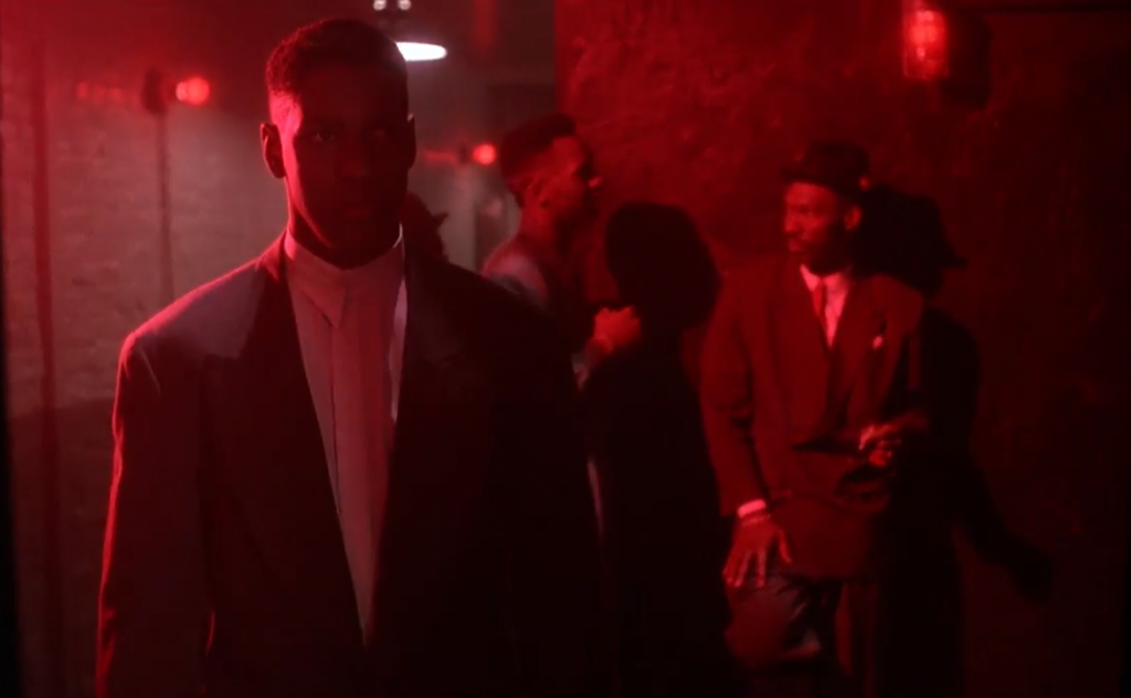
I REALLY liked this shot. After Bleek finds out that both of his “flings” were at the club, he sees Shadow talking to Clarke. As he’s walking in Indigo’s direction, red lights illuminate the entire hallway. Lee uses red lights to indicate that Bleek is going into the “danger zone”. As I was watching this scene, I was like “Oh no. He’s in trouble” and I think that’s exactly what Lee was shooting for.
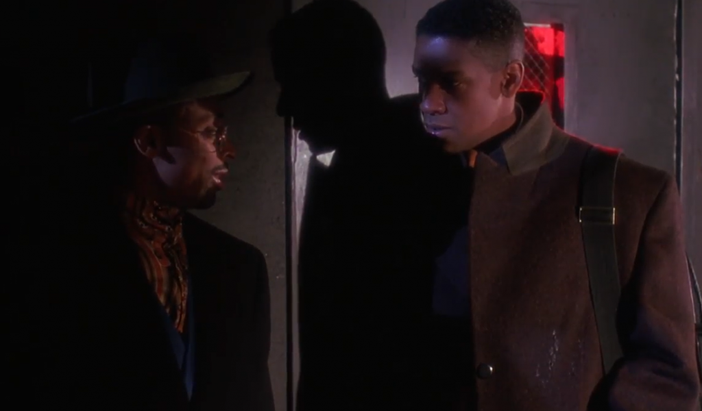
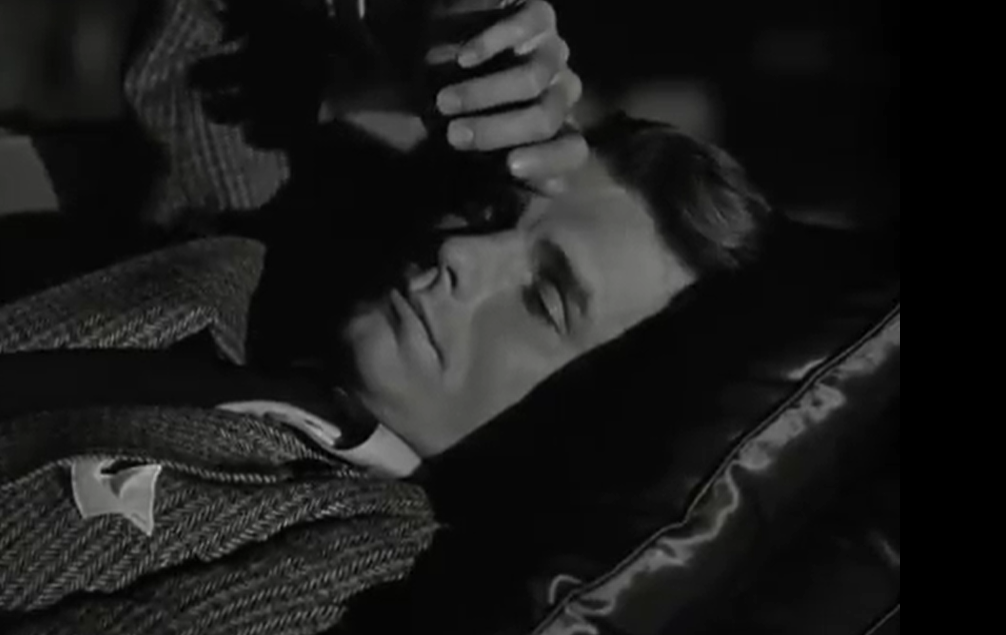
I found this entire sequence to be interesting but also confusing. The Bleek’s shadow doesn’t really look like a shadow. At first, maybe, but as I continued watching, I kept squinting my eyes and looking closer at the screen. The angle of the shadow made it look like someone else was behind him. It seems like the shadow is actually an actor, given how stark the shadow is. The movement when Bleek spun around made it seem like the shadow wasn’t a shadow, but when the door opened, you saw that it was his shadow.
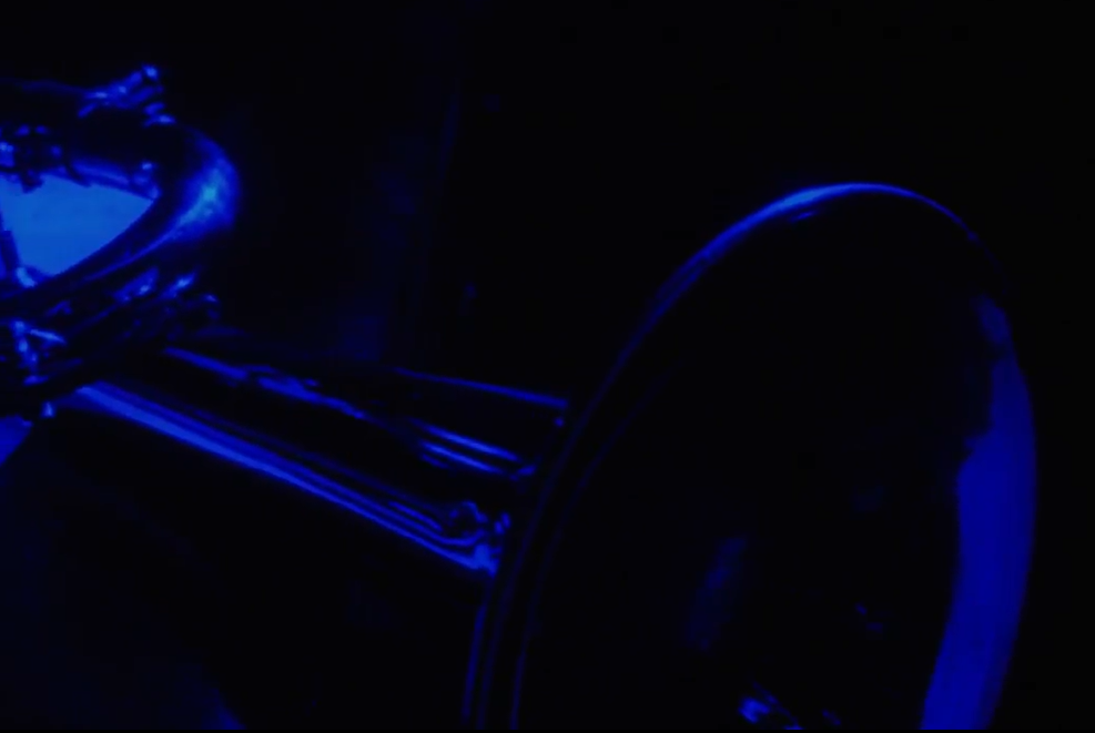
Along with a lot of red, Lee uses a lot of blue lighting. While Clarke is singing, the stage is lit up with blue fluorescent lights. The color blue is often associated with sadness and misery. When you look back at the scene, you realize that she’s singing a sad song. Clarke is up on stage beside Shadow, and Bleek has just walked in. Their prolonged eye contact stresses that what they had is gone, and they can’t go back anymore.
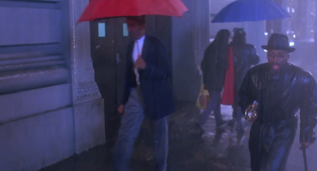
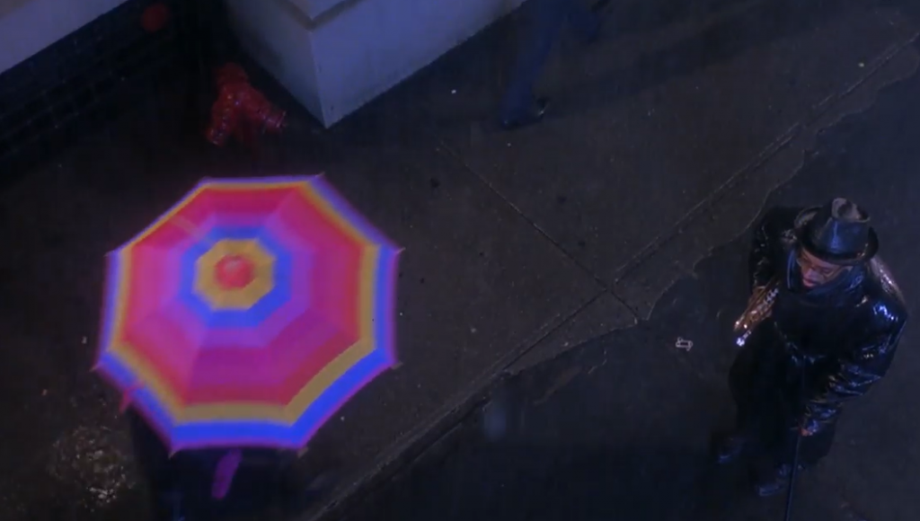
I like the use of the different colored umbrellas in this scene. In the sea of black umbrellas, there is one red, one blue, and then an overhead shot of a rainbow colored umbrella. These colors draw to the scene and make the audience pick up on the emotions that Giant’s character is experiencing. Red means anger, and blue usually signifies sadness. In this scene, Bleek tried performing on stage after his accident, but couldn’t do it. He handed his beloved instrument to Giant and walked away. Giant immediately started yelling and trying to catch up to him, but when he couldn’t, he shouted, “You will play again!” Lee does this to show that Giant is feeling both angry and sad in the moment.
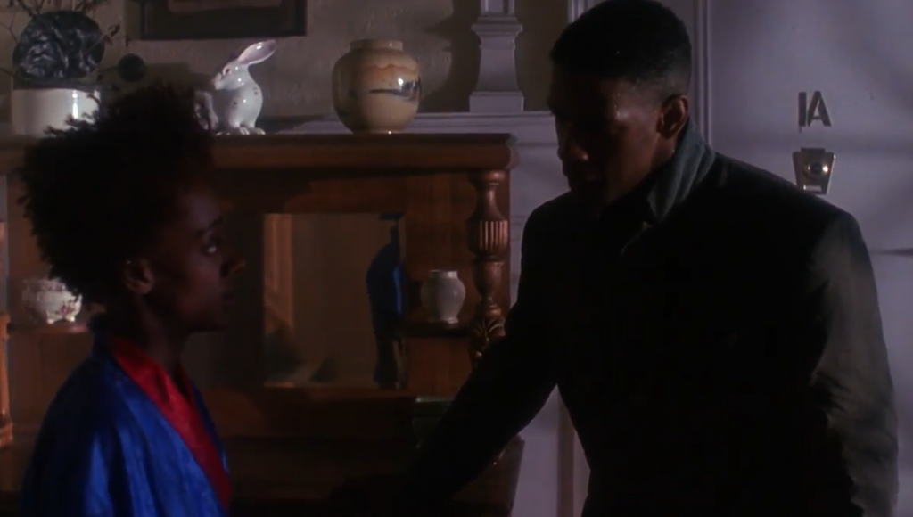
The same thing is portrayed in this screenshot. Bleek had gone to Indigo’s house, and when he confronts her, she’s wearing red and blue to express to the audience that she’s mad and sad. Explaining what her wardrobe can’t, she tells him that she hasn’t heard from him in a year. Seeing someone after a year of no contact would trigger those two emotions, and I think Lee does a good job of portraying this to the audience.
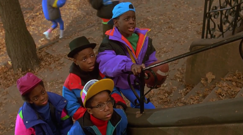
The ending felt like a “circle back to the beginning” moment. Bleek’s child’s friends are begging him to come out and play. The colors they’re wearing are very bright and vibrant, much like what a child would wear.
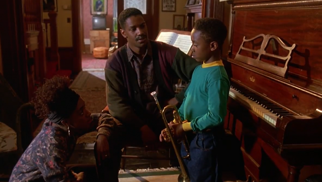
And this shot is exactly like the beginning, and how Bleek had to tell his friends to leave him alone during his lessons. In the screenshot to the right, Bleek is wearing neutral colors to portray that he’s expected to act like an adult and is restricted from having fun. But with Bleek’s son, he’s wearing bright colors, like his friends. Bleek lets his son have fun and lets him be a kid.
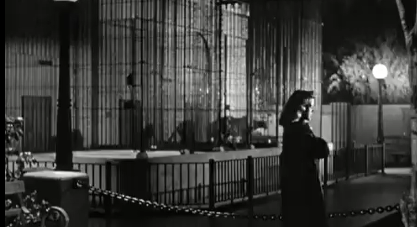
Cat People
In black and white films, you are more restricted from colors and have to rely more on the different shades of gray. You have to pay more attention to what the actors are doing versus what they’re wearing. In The Last Detail, it states that “the film stock registers as a series of shades of gray, which filmmakers can control through their use of light and careful selection of costumes and set design colors. While they don’t show up as their original colors on the film stock, a red dress would look differently from a blue dress…”
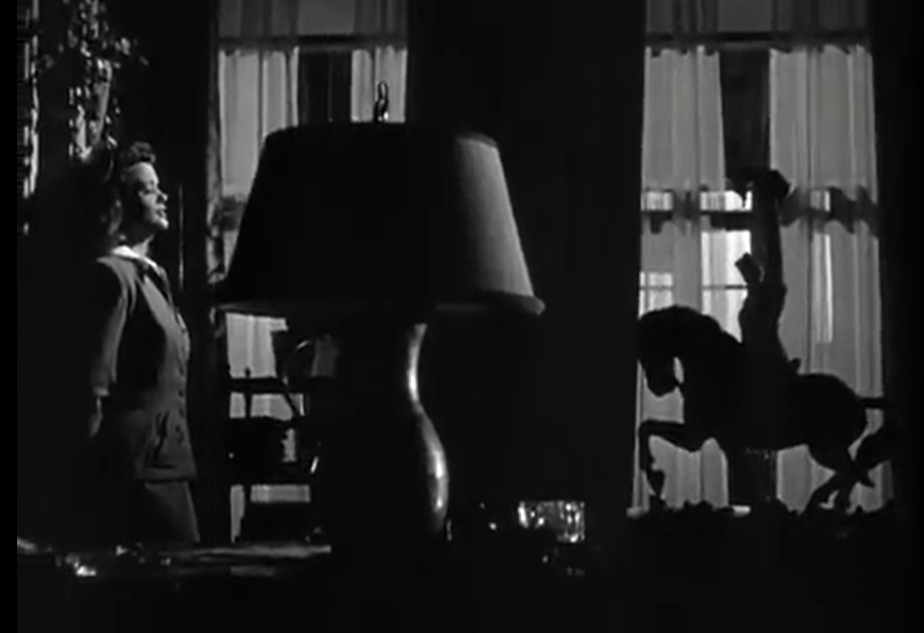
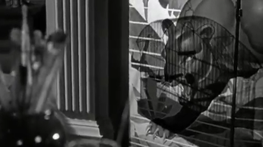
The film starts with the camera showing the setting where the character is. In this shot, objects are seen with the “lack of light”. The shadow of the object is what shows the object. I don’t need color to see that that’s a horse decoration on the right.
The lighting here is done in a way where only his face is lit up, and the back half of his head is in the shadow.
I found this shot interesting because, as the camera zoomed out, you could see different types of cats from different angles. Tourneur does this to stress Irena’s obsession.
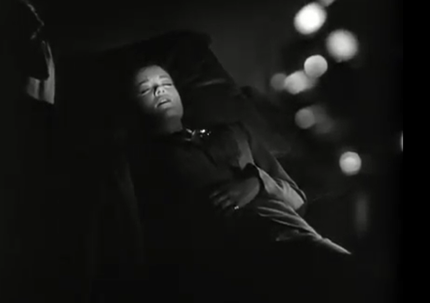
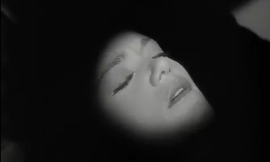
As I stated before, the filmmaker controls the lighting in a way so that only her face is lit up. Tourneur only needs to light up her face to show that she’s sleeping. Having her whole body clothed in light would be pointless.
Every time the camera is on the wild cats in the zoo, the jaguar stands out the most. The big cats are black, and their shadow is darker to draw the audience’s attention to them.
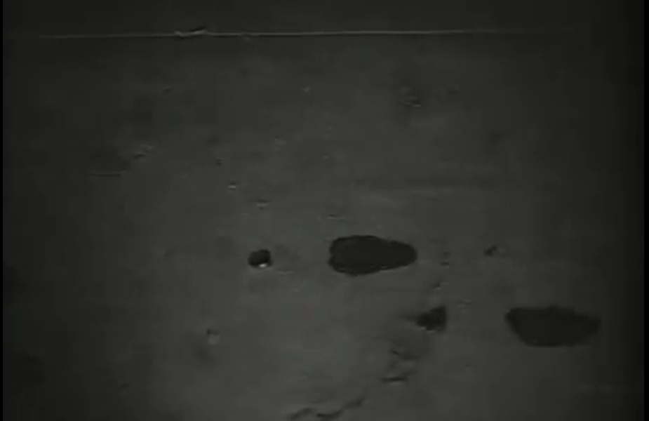
The Last Detail explains how the popular thriller film director, Alfred Hitchcock, used “chocolate syrup to simulate the look of blood swirling down the shower drain, because the brown of the syrup, as well as its consistency, looked more striking in black and white”. In this screenshot, the splotches on the ground indicate that those spots are blood. Perhaps the red color didn’t show up as well, so Tourneur used a different shade, such as brown.
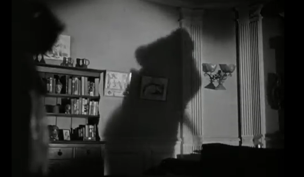
Throughout the whole film, you don’t get the confirmation that Irena can transform. You usually see her human form in one scene, and a black cat in the next. In this scene, Tourneur uses shadows here to show her transforming, even though you don’t see it. I’ve seen filmmakers do this a lot: using the character’s shadow on the wall to illustrate to the audience that the character is transforming, whether it’s from human to animal or human to meta-being.
Leave a Reply